Developing the Metthods website to showcase Interior Design work to the online world with international standard websites
Metthods Interior Design Studio is a project to design and develop a website for an interior design studio from Chiang Mai that seeks a website that clearly reflects the brand's identity, featuring a sleek dark color tone, large project images, and meticulously selected details from colors, fonts, to the layout of every page.
Introduction
Who is Metthods
Metthods is an interior design and built-in furniture studio from Chiang Mai, offering design services across various types, from residential homes, condominiums, restaurants to offices and commercial spaces, with a focus on detail-oriented design that emphasizes unique elegance.
Why Have a Website
When a design business seeks a website, expectations are naturally higher than usual, as a website is not just a channel for information but the "face of the brand" that customers will see first. For an interior design studio, the website must convey craftsmanship from the very first moment it is accessed.
Metthods wants a website that is not just "having a site" but one that clearly reflects the brand's identity, including elegance, premium quality, and attention to detail, which are the core values of the business.
"For a business that sells design work, the website is the first piece of work that customers will judge the craftsmanship by."
The Beginning of the Project
What makes this project interesting is that the client did not just come to say, "I want a beautiful website," but came with a clear vision, reference images, a desired style, and guidelines on fonts and color tones from the very beginning, which is a great starting point for collaboration, as both parties have aligned directions from day one.
MAF was tasked with taking those ideas and developing them into a functional, beautiful website that perfectly reflects the identity of Metthods.
Issues
Client's Requirements and Expectations
The client has a clear vision for the website, with distinct primary requirements that set it apart from typical websites:
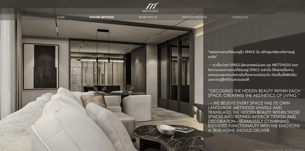
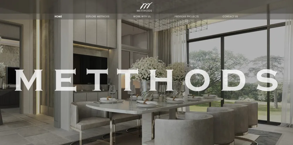
The portfolio images must tell the main story — They need to be displayed in full screen, allowing visitors to immediately feel the atmosphere of the design work, not just small images in a frame, but images that convey the quality of the work.
The website's color tone must be deep and rich — The client desires a dark, muted color palette, rather than a bright and vibrant website, to create a premium and elegant feel that aligns with the studio's image.
Play with color transparency — The client wants images and elements to overlap with depth, using transparent color techniques to create layers of depth on every page.
Initial font guidelines are provided — The client has a preferred font style and seeks a team that understands and can build upon that concept, rather than starting from scratch.
Project Challenges
The main challenge is not just to
Plan & Guidelines
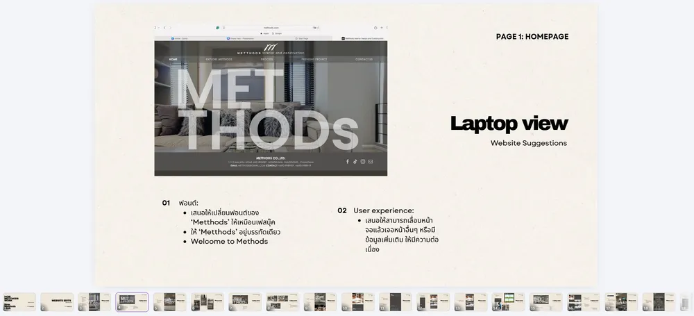
We start from the guidelines provided by the client, including reference images, preferred styles, and desired fonts, and then analyze what can be realistically used on the website, what needs to be adjusted, and what needs to be added to ensure the best user experience.
Layout — Let the Images Take Center Stage
Design the webpage structure so that the works are the main focus, reducing unnecessary elements to let the works speak for themselves. Visitors can perceive the quality of the design without needing to read much; just seeing the images conveys the level of work this studio produces.
Color Tone and Transparency Techniques
Use a dark color tone as the main background of the website to create a premium atmosphere from the first entry.
Incorporate transparent color techniques in various areas, such as overlapping sections on images or the background of text, to create depth and dimension without obscuring the works.
Select all color tones to align with the brand, using dark colors that convey stability and warm colors that are interspersed to add refinement and tasteful luxury.
Font Selection
The client had guidelines regarding fonts from the beginning, so we collaborated to fine-tune them, choosing fonts that reflect professionalism and elegance, with a clean and easy-to-read appearance while still having a distinctive personality. Both the main headings and general content are paired harmoniously for comfortable reading on both computers and mobile devices.
Responsive Design
Plan for display across all screen sizes from the start, rather than designing for desktop first and then scaling down. Consider the entire system simultaneously to ensure a good experience on all devices.
"All guidelines do not come solely from us, but are a collaborative effort with the client, starting from their vision, and we help to bring it to life on the web."
Process
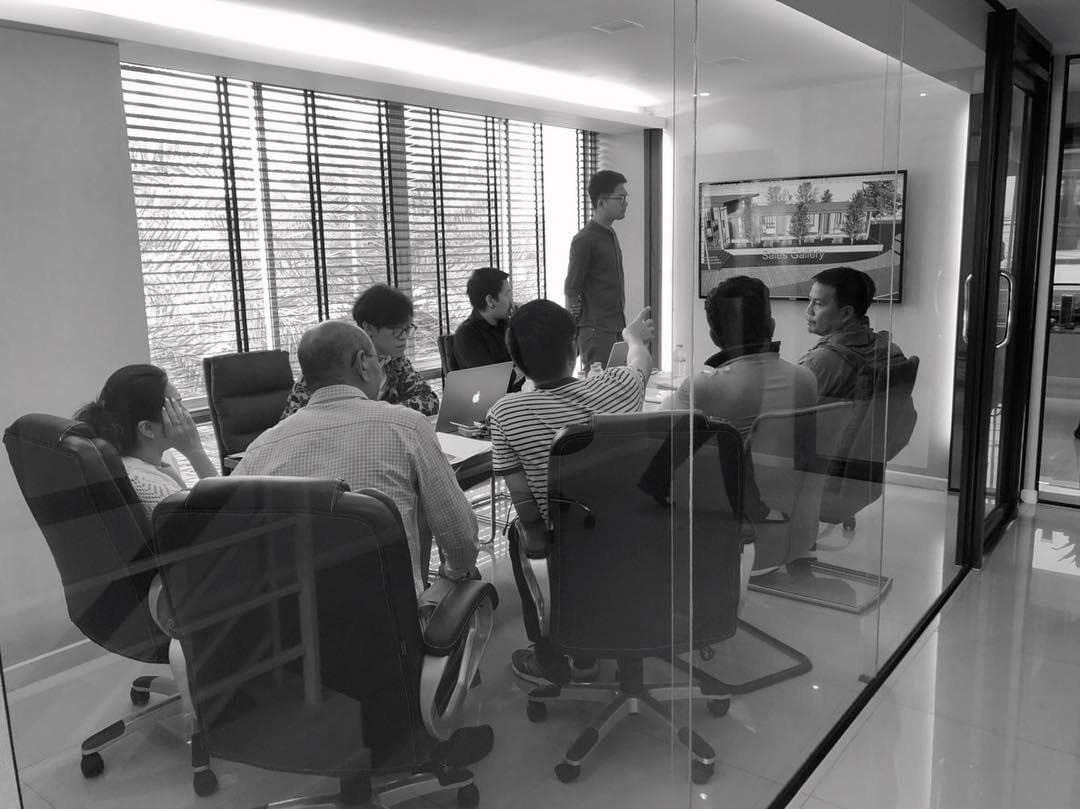
This project is a collaboration between MAF and the client from start to finish. It is not about receiving a brief and working alone, but a process where both parties are involved in every step.
1. Receive Brief and Guidelines from the Client
The client sends reference images, desired styles, as well as initial guidelines regarding fonts and colors. We study and understand the client's business, target audience, and the image they wish to convey to ensure mutual understanding before starting the design.
2. Analyze and Design
We analyze all the guidelines and design a layout that emphasizes the work. We choose a dark color tone mixed with transparent techniques and adjust the fonts to suit actual web use, considering size, weight, and spacing.
3. Collaborative Adjustments
We present the design for the client to review and collaboratively adjust details such as colors, fonts, layout, and spacing until both parties are satisfied with the results. This step is crucial because small details make the difference between a good-looking website and a poor one.
4. Develop the Website
We begin building the actual website, taking care of:
Loading speed, even with large images.
Responsive design to ensure it looks good on all devices.
A systematic website structure suitable for showcasing a portfolio.
Easy future content updates.
5. Final Delivery and Adjustments
We check every detail with the client before going live, testing the display on multiple devices and browsers, and making final adjustments until it is ready for launch.
"Every step involves the client in the process because a good website must arise from mutual understanding, not guessing."
Results
The website metthods.com clearly reflects the brand's identity from the very first moment you enter. Every element has been carefully selected and arranged.
What You Get
Outstanding Project Images — Displayed in large size, allowing visitors to immediately perceive the quality of the design work without needing to read much; just seeing the images conveys the message.
Premium Atmosphere — Deep, rich tones combined with transparent techniques create a luxurious and dimensional feel on every page.
Perfectly Selected Fonts — Chosen and fine-tuned in collaboration with the client, conveying professionalism and elegance.
Functional — Loads quickly and displays beautifully on computers, tablets, and mobile devices.
Portfolio Structure — Showcases work in categories, making it easy and interesting for clients to view the projects.
Project Overview
Every element on the website, from colors, fonts, spacing, to the way projects are displayed, works together as a cohesive system. The result is a website that not only looks good but clearly communicates Metthods' identity as "a studio that cares about every detail."
"A good website is not just beautiful; it must immediately convey to visitors who this brand is, what it does, and why they should choose it."
The website metthods.com is now open for viewing.
Ready to Start Your Project?
Contact us today for a free consultation and start turning your business vision into reality
